
Home » Alle berichten » Productivity » Choosing the right venn diagram alternative for clearer thinking, sharper communication and better decisions
Choosing the right venn diagram alternative for clearer thinking, sharper communication and better decisions
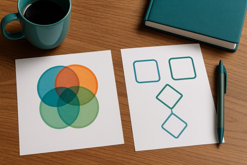
When comparing complex ideas, identifying overlaps or mapping shared characteristics, the classic Venn diagram is often the first tool people reach for. But as information grows more detailed and relationships become more nuanced, traditional overlapping circles can fall short. Choosing the right venn diagram alternative allows you to communicate with greater precision, avoid visual clutter and uncover insights that simple diagrams cannot show. This article explores powerful alternatives, when to use them and how to build them effectively.
In short:
A venn diagram alternative provides more flexibility when relationships involve direction, hierarchy or multiple variables.
Some alternatives — like Euler diagrams or matrix maps — reduce noise by removing unnecessary overlaps.
Visual tools matter only when they clarify thinking, not when they add decoration.
Choosing the right structure depends on whether you want to compare, categorize, diagnose or prioritize.
Testing diagrams with small data samples prevents confusion when scaled.
Why choosing the right venn diagram alternative matters
The traditional Venn diagram is elegant and intuitive, but it becomes limiting when relationships are complex or dynamic. Three or more circles often create clutter or misleading intersections. A venn diagram alternative can represent relationships more accurately, particularly for strategic planning, product positioning, behavior mapping or decision analysis.
As TheGrowthIndex.com often notes, visual clarity directly influences decision quality. When teams rely on diagrams that oversimplify or distort information, discussions lose focus. Choosing the right structure ensures that complexity becomes manageable rather than overwhelming.
When a venn diagram alternative offers superior clarity
A major weakness in traditional Venn diagrams is that they imply complete and equal intersections even when relationships do not behave this way. Many real-world relationships overlap unevenly or require dimension-based comparison rather than categorical overlap.
For example, comparing user segments, market forces or product features often requires directional relationships, weighted areas or hierarchical frameworks. The right venn diagram alternative will expose subtle distinctions that circles cannot show.
Also interesting


Euler diagrams as a cleaner venn diagram alternative
Euler diagrams resemble Venn diagrams but remove intersections that do not exist. This makes them ideal when comparing categories that partially overlap but do not intersect in every combination.
Unlike Venn diagrams, which force all possible intersections to appear, Euler diagrams show only relationships that matter. This reduces visual noise and focuses attention on meaningful similarities. They are especially useful for mapping capabilities, behaviors or customer groups.
Matrix comparisons for structured analysis
A matrix format is one of the most versatile alternatives. It maps items along two variables — for example, importance and effort, or risk and reward — providing more nuanced comparison than simple overlap.
Matrix maps are ideal when evaluating strategic decisions because they make trade-offs visible. For instance, product teams often use matrices to prioritize features, and operations teams use them to classify risks. This venn diagram alternative works particularly well when evaluating more than three categories at once.
Quadrants as a decision-focused venn diagram alternative
Quadrants provide structure without complexity. They work best when comparing two axes, such as speed vs. quality or innovation vs. feasibility. By placing items into four fields, this tool helps leaders visualize balance and identify outliers.
Quadrants are especially powerful when positioning products, mapping competitors or diagnosing team behavior. The simplicity allows for quick decisions without oversimplifying relationships.
Concept maps for relationship-heavy contexts
Concept maps represent relationships through nodes and connecting lines. They offer more flexibility than Venn diagrams because they show direction, causal links and overlapping relationships.
This venn diagram alternative is ideal for:
mapping organizational workflows
documenting customer journeys
illustrating how ideas connect
visualizing multi-step processes
Concept maps reveal structural relationships that would be hidden in overlapping circles.
"The best diagrams don’t simplify complexity — they reveal the structure within it."
Flowcharts when order or sequence matters
If your data involves sequence, timing or decision trees, flowcharts outperform any other diagram. They help identify bottlenecks, clarify processes and diagnose inefficiencies.
While not a traditional comparison tool, flowcharts act as a venn diagram alternative when the goal is to compare pathways rather than categories. They highlight differences in steps rather than differences in attributes.
Spider charts for multi-dimensional comparison
Spider charts (also known as radar charts) provide a unique venn diagram alternative for comparing attributes across multiple categories. They plot variables on a radial axis, allowing you to see strengths and weaknesses at a glance.
These diagrams are useful when comparing:
product feature sets
skill profiles
performance metrics
competitive analysis
Unlike Venn diagrams, which only show overlap, spider charts show degree, intensity and distribution.
Decision trees as a venn diagram alternative
Decision trees guide thinking when choices branch based on criteria. They are particularly useful for diagnosing problems or planning strategies.
For example, customer support teams can use decision trees to classify cases, while analysts use them to determine risk pathways. This structure reveals the logic behind decisions rather than simply mapping shared attributes.
Step-by-step guide: how to choose the right venn diagram alternative
Use this process to choose the best structure for your information:
Step 1: Identify the relationship you are visualizing
Is it overlap, comparison, hierarchy, sequence or influence? The nature of the relationship determines the tool.
Step 2: Define how many variables you need
Circles fail after three variables. Matrices, spider charts or concept maps handle complexity better.
Step 3: Test with small samples
Sketch a test diagram with only 3–5 data points. If it feels crowded, switch to another structure.
Step 4: Consider the story you want to tell
Diagrams succeed when they make your message clearer. Choose the structure that supports your narrative.
Step 5: Validate with your team
Ask: “Does this diagram answer the question we’re exploring?” If not, refine or choose another structure.
This method ensures your diagram supports decision-making instead of complicating it.
Using venn diagram alternatives in strategy work
Strategists increasingly rely on venn diagram alternatives because modern business problems involve multi-dimensional relationships. Matrices help prioritize initiatives, concept maps reveal cultural issues and quadrants clarify risk profiles.
One of the most effective uses is mapping capabilities. Traditional Venn diagrams fail to show capability strength or dependency, while spider charts or capability matrices reveal gaps clearly. This approach is frequently discussed on TheGrowthIndex.com, where clarity drives better scaling decisions.
Also interesting


How visual tools influence real-world decisions
Diagrams influence not only understanding but also behavior. People make decisions based on visual patterns, and the wrong structure can subtly mislead them. Overlapping circles imply equal weight; matrices imply prioritization; concept maps imply interconnectedness.
When you choose a venn diagram alternative, you are choosing a cognitive framework. Being intentional ensures the tool matches the insight you want to express.
Common mistakes when choosing a venn diagram alternative
Several pitfalls weaken diagram effectiveness:
choosing visually appealing tools that do not match the data
forcing categories into symmetrical shapes
overcomplicating diagrams with too many labels
ignoring visual hierarchy
misunderstanding the relationships being described
Avoiding these mistakes helps your diagram achieve its purpose: clarity, not decoration.
Building hybrid diagrams for unique situations
Sometimes no single venn diagram alternative is enough. In these cases, hybrid diagrams provide the best clarity. For example, combining a quadrant with a concept map allows you to show both position and relationships.
Hybrid diagrams are especially useful in innovation workshops, customer journey mapping and strategic planning. They allow you to tailor your visualization to the complexity of your problem.
How digital tools expand venn diagram alternatives
Modern tools such as Miro, FigJam, Obsidian Canvas, Whimsical and Notion offer templates and dynamic linking features. These platforms support diagrams that adapt as your understanding evolves.
Digital environments make it easier to test alternatives quickly, rearrange data and collaborate with teams. They also integrate with broader systems, reducing friction during brainstorming.
Using venn diagram alternatives to improve communication
Visual diagrams are communication tools, not just analytical tools. The right structure helps teams internalize ideas faster, reduces misunderstandings and accelerates decision-making.
When diagrams reflect real structure rather than forced overlap, teams stay aligned. When they are used intentionally, they become powerful storytelling tools rather than static visuals.

Lina Mercer
Lina Mercer is a technology writer and strategic advisor with a passion for helping founders and professionals understand the forces shaping modern growth. She blends experience from the SaaS industry with a strong editorial background, making complex innovations accessible without losing depth. On TheGrowthIndex.com, Lina covers topics such as business intelligence, AI adoption, digital transformation, and the habits that enable sustainable long-term growth.